GOD MAKES ORIGINALS
an event case study
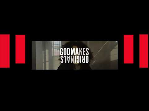
We will be braking down one of our projects was with Bethel Music for their Worship School. The branding centered around the theme "God Makes Originals". It was full of texture and mixed media. I was also able to help build out their main promo for this conference. So I was able to quickly and easily re-purpose all the original assets. We will use this project as the example for the LED story line for a standard service. To give you the proper context this was their LED layout was you can see the images below.
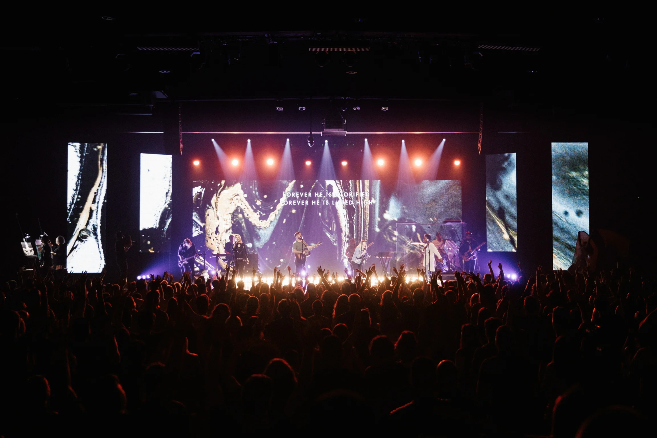


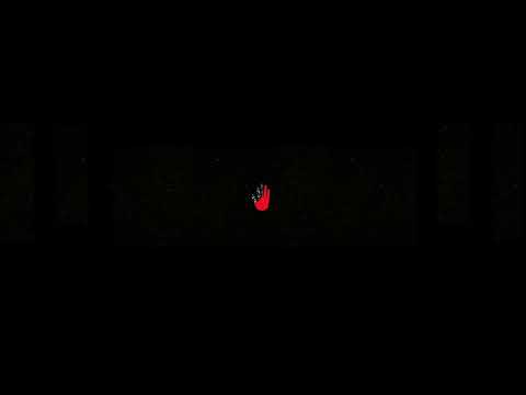
01 . WALK IN LOOKS
The walk in look can be something subtle or large. I tend to want to lean towards a subtle look on the first session and then something a bit more immersive on the following sessions. I find that it adds to the anticipation if you don't see the full stage until the first session begins.
For the first session of Worship School we started using with using the main mark (the changing hand) and just a speckle texture across the screens. I would definitely suggest doing something similar since it helps build the anticipation and creates a little healthy tension before the opening.
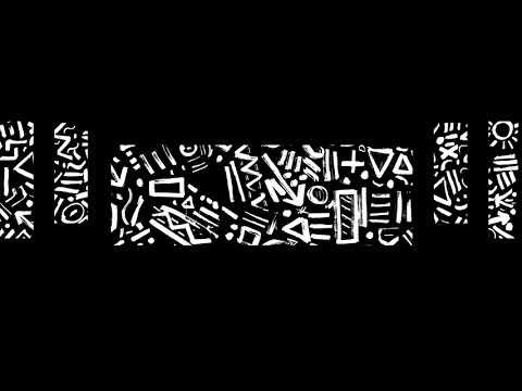
2. Openers & Specials
When you create a secondary edit for the stage screens in a conference I feel like it just makes the room come alive in a way that Imag screens just cant achieve. It doesn't do it justice on here but when this opener plays along side the imag screens and lights on queue any content just makes the experience even more rich.
3. WOrship Content
Worship visuals are a large portion of the work I am covering these days. As we get closer to the dates I can help further collaborate with Gateway Worship to create a solid song/visuals list to ensure there would be enough content for the event. I am currently working with Adrian to create content for Gateway Conference. There are typically two starting price points on this content. One for loop-able content that has chorus, verse and bridge parts. The higher cost visuals are for song specific visuals. This can be seen in some of the content I have created for Bethel in the past.
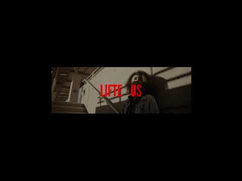
4. Transitional videos / Speaker Walk ups
You are most familiar with these elements I feel like. At Gateway they happen every week and are pretty self explanatory. For this event we had 6 different versions sharing the same elements. So for this one it was a bit more in-depth than a sermon series at Gateway. There was simply more variance.

This is an example of what that transition looked like during the conference.
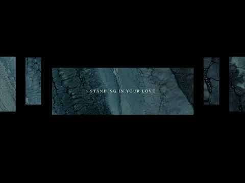
5. Speaker looks
The speaker looks for this specific conference was highly themed. I know you mentioned you didn't want to have these looks to be so heavily branded. But these were a solid representation of how the brand extended and pushed to really see what all the art direction could provide. You see a little of this variance in Christine Caine's message as well.
For Heaven Come in Dallas we went with more image based backdrops that helped more so carry the tone of the event. But I'd love to explore these more with you and make sure we can get these right.