The Seed CoMPANY
Thank you for the opportunity to collaborate with your team on this project. Below you will find a 3 concepts for you to review. If at any point you have any questions, comments or concerns, feel free to give me a ring. Once you have had time to review all the concepts and you are ready to proceed, let's set up a time to jump on a call or FaceTime to talk through the decision. Thank you again for your time and consideration.
Thank You,

Freehand Illustration
CONCEPT Style Number ONE

Freehand illustration is probably my favorite form of illustration. It simply feels authentic. The amount of detail and genuine artistry is undeniable. It is a form that draws in viewer to examine every inch of its canvas. In the top left, John Hendrix has illustrated his pastor's Sunday morning sermon notes. He quotes Revelation 3:87 and off of that stems several complimenting thoughts and Ideas. In the top right he does the same with the imagery and story of Cain. Upon researching for this project I found this concept to be extremely compelling. The idea of presenting the main theme and drawing the audience closer to discover the context could prove to be extremely successful for this project. With this layered approach we allow for the audience that sees the poster as a stand-alone piece to experience the artwork in a unique way apart from the video. These illustrations lean on the darker side. It is a little more mature and does require more attention from the audience or viewer. However, the filp-side of that does mean that the content can be more profound or thought provoking.
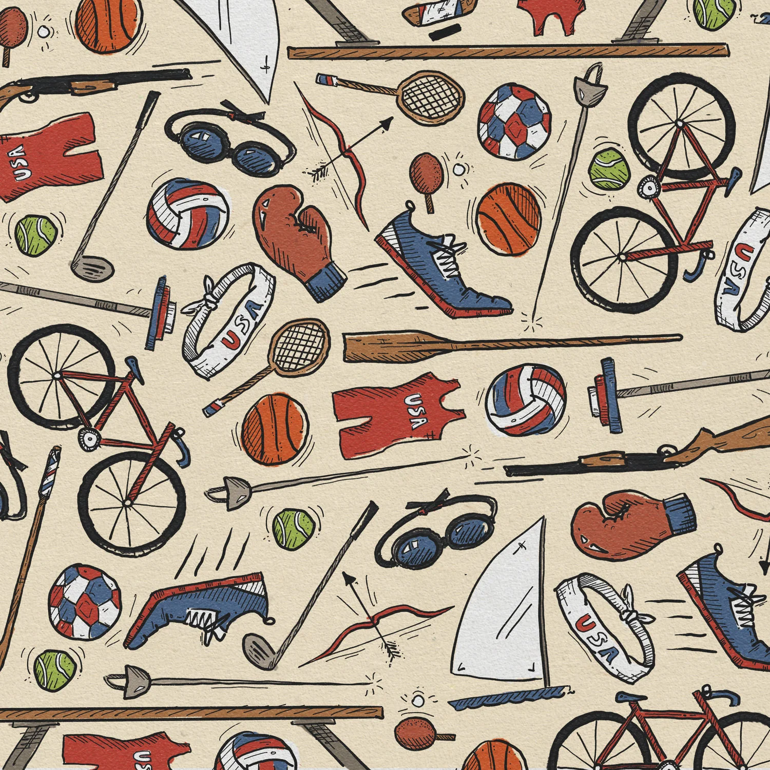
- Feels authentic, genuine and organic.
- Not locked into a linear story line.
- The range of photorealism can vary.
- It is hand crafted and feels handmade.


The animation style for this concept will lean on more organic reveals. Through brush strokes, bleed through and simple cell shading the presentation of the content will carry that same organic and handmade feel. Below are some examples of how the colors, type and illustrations could be revealed.

Vector Illustration
CONCEPT Style Number TWO

Vector illustration is a much more clean approach to the videos. This style tends to work well with presented material like Infographics. The dates, locations and information over all is presented in a clear and concise way. The above below examples are also isometric designs. This adds another layer of complexity and character that literally provides an alternate perspective on the content being portrayed. Below is a more traditional infographic that presents a large amount of information and illustrated how a large amount of the information could be presented.


On the video side of this concept the style is a traditional motion graphics style. The objects slide, grow and shift to transition on and through the frame. The storyline for this type of animation can be linear or non-linear depending on the desired design and layout. I feel like this style creates a world that information can be presented and then moved together at the end to reveal the whole picture. The top video example is in the isometric style. And the one below is a vector animation with a more textured treatment.
Comic Illustration
CONCEPT Style Number THREE


Comic illustration is a type of combination of the freehand and vector illustration. The format follows a linear storyline and tends to lean more on the cartoon end of the spectrum. This style is very approachable and palatable for a large demographic due to its classic style. The style features strong character design. It also illustrates clear scenes every step of the script. It carries the visual load for the audiences and does not rely on their imagination to fill the gaps.

The video for this concept would work just like The Bible Project's version. It is a bit of a combination of the above styles. Objects can be revealed on as if they are being drawn or they can animate in as motion graphics would.
- Classic
- Linear storytelling
- Character driven visuals
- Palatable for all audiences
Closing Thoughts

Writing Style
As we embark on this collaboration, I am inclined to encourage the writing of the script to pursue more of a playful or witty approach. This is an example of how I feel a script could both appeal to The Seeds Company audience and still be a bit entertaining. I feel that with 5 minutes of information, the video could easily become overbearing or cumbersome. However, if we made it fun or at least witty, it may help make the content more digestible. I would love for it to take on more of an intelligent, witty performance, than a long, stale presentation.
Custom Music
I feel with the both videos being presenting it would be a great opportunity to have a custom score for these videos. I believe I can squeeze in the cost within the provided budget. I think this would allow for both videos to feel related and branded in a similar fashion as the visuals will be. Additionally, from a musical perspective I do like the progressive nature of this example but I would like to tone down the digital feel. I would like the musical progression should follow the scripted beats and grow to be more present and intricate as we progress toward the climax or reveal of the full poster example.